Beginner Guide to Building a Sales Dashboard for Small Business (with Pictures)
Published:

As a small business owner, managing everything from sales to customer service can feel overwhelming. But tracking your sales performance doesn’t have to be! In this simple guide, I’ll show you how to create a sales dashboard using Google Sheets, perfect for beginners. We'll use a fictional skincare brand, Pure Glow Skincare, to walk through the steps—whether you're working with real or mock data, this guide will help you easily track and visualize your business's performance.
Gather and Organize Your Sales Data
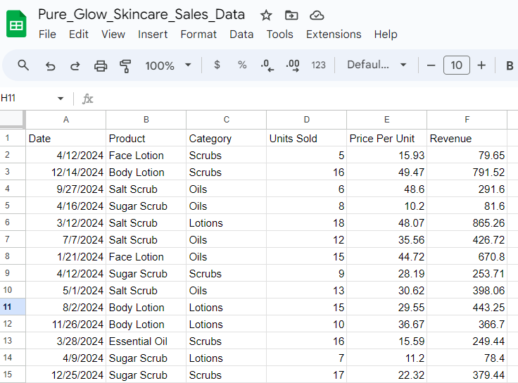
Before diving into building a dashboard, start by gathering your sales data. This might come from your Point-of-Sale (POS) system or manual tracking. Your data should include:
Product Name (e.g., Essential Oil, Body Lotion)
Category (e.g., Lotions, Oils, Scrubs)
Units Sold
Price Per Unit
Revenue
Organize this data in Google Sheets with clear headers like Date, Product Name, Units Sold, evenue, and more. Having clean, structured data is key to building an effective dashboard.
Pro Tip: If you're using a POS system, you can usually export your data directly, making it easy to plug into Google Sheets.
Create a Dashboard Title
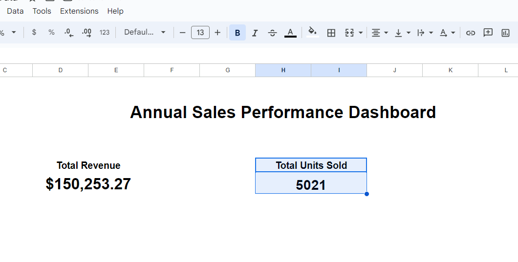
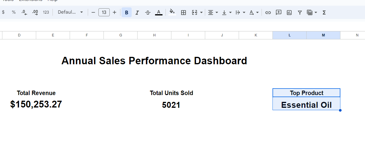
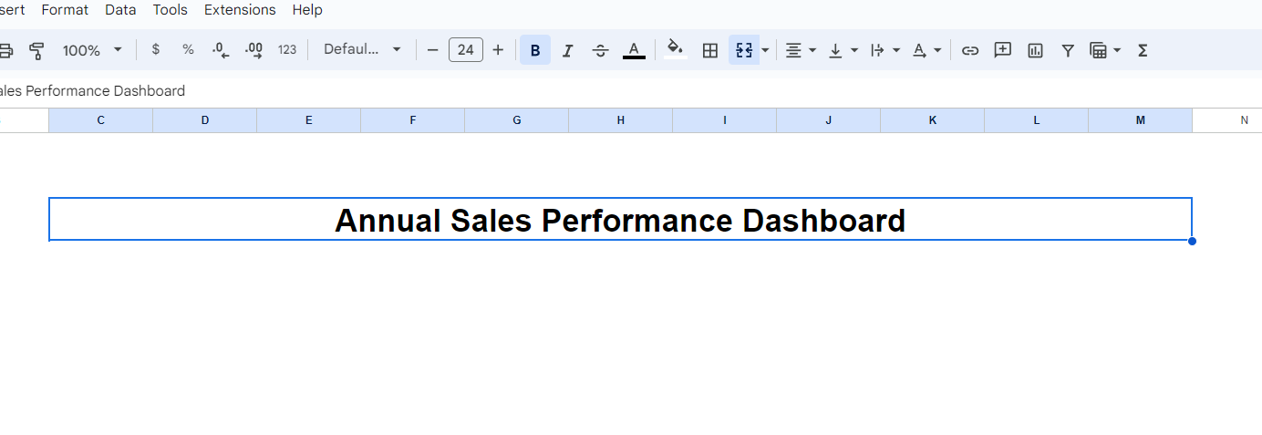
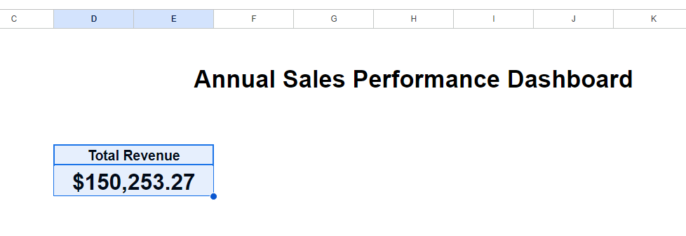
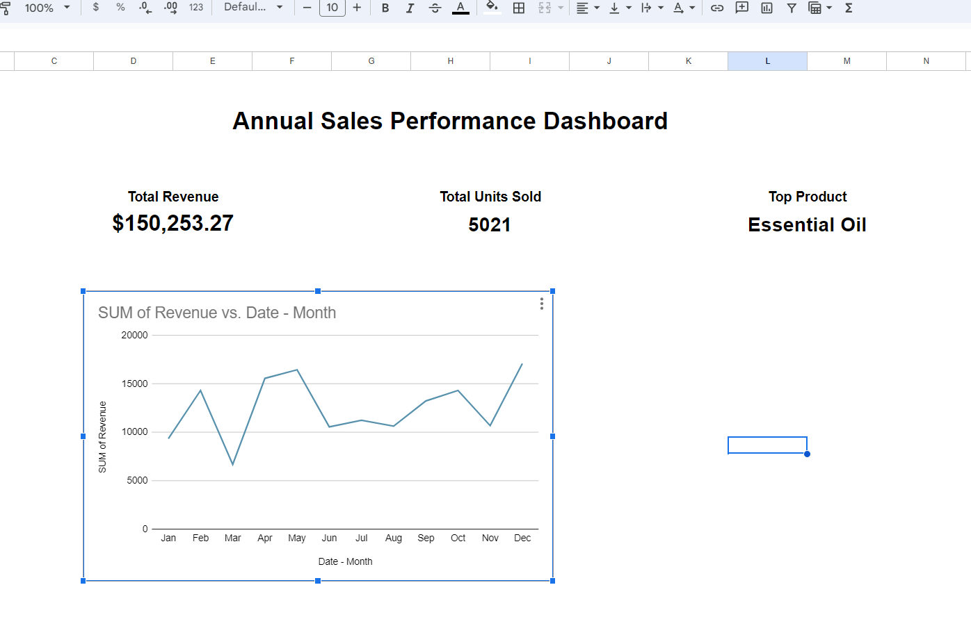
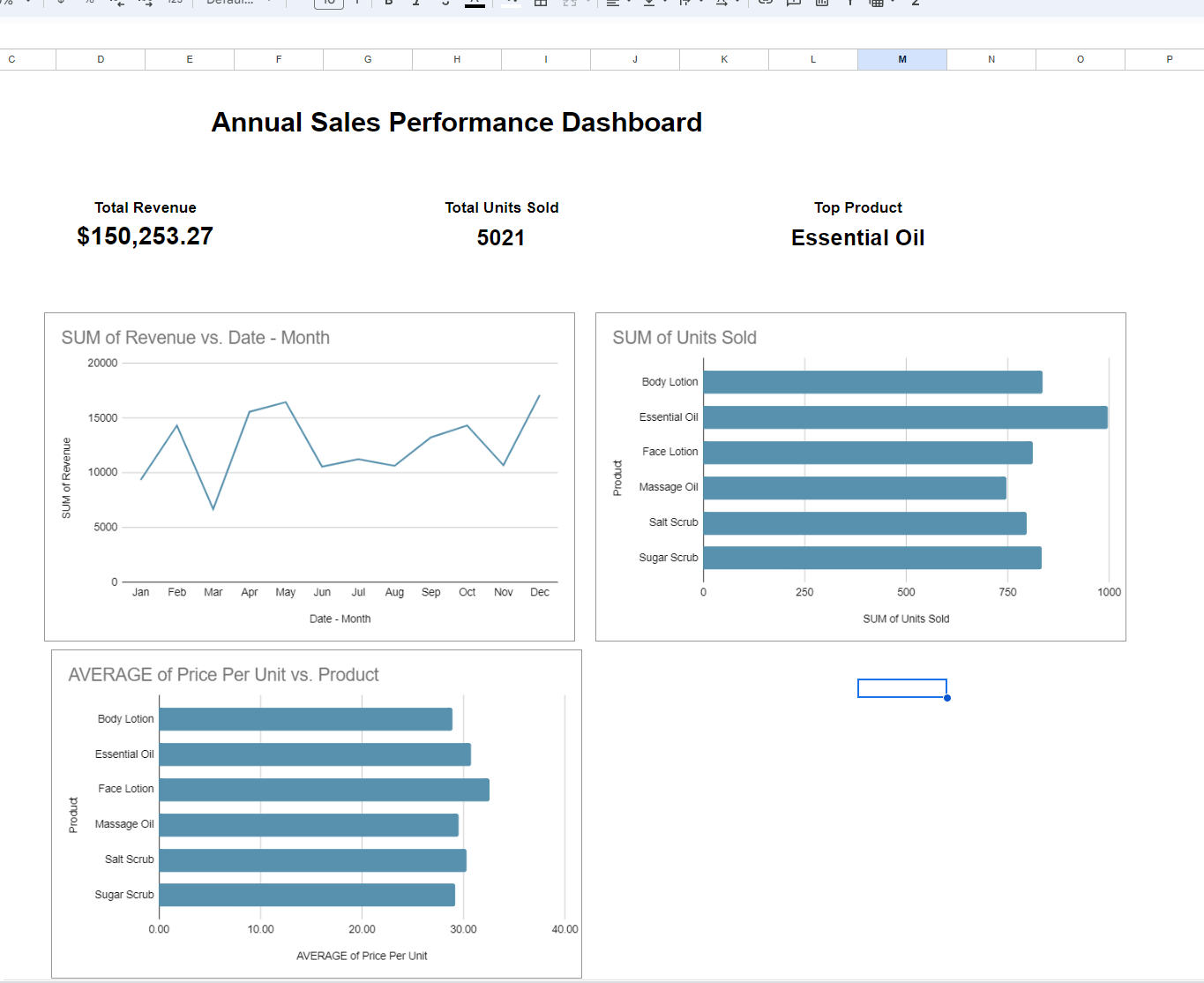
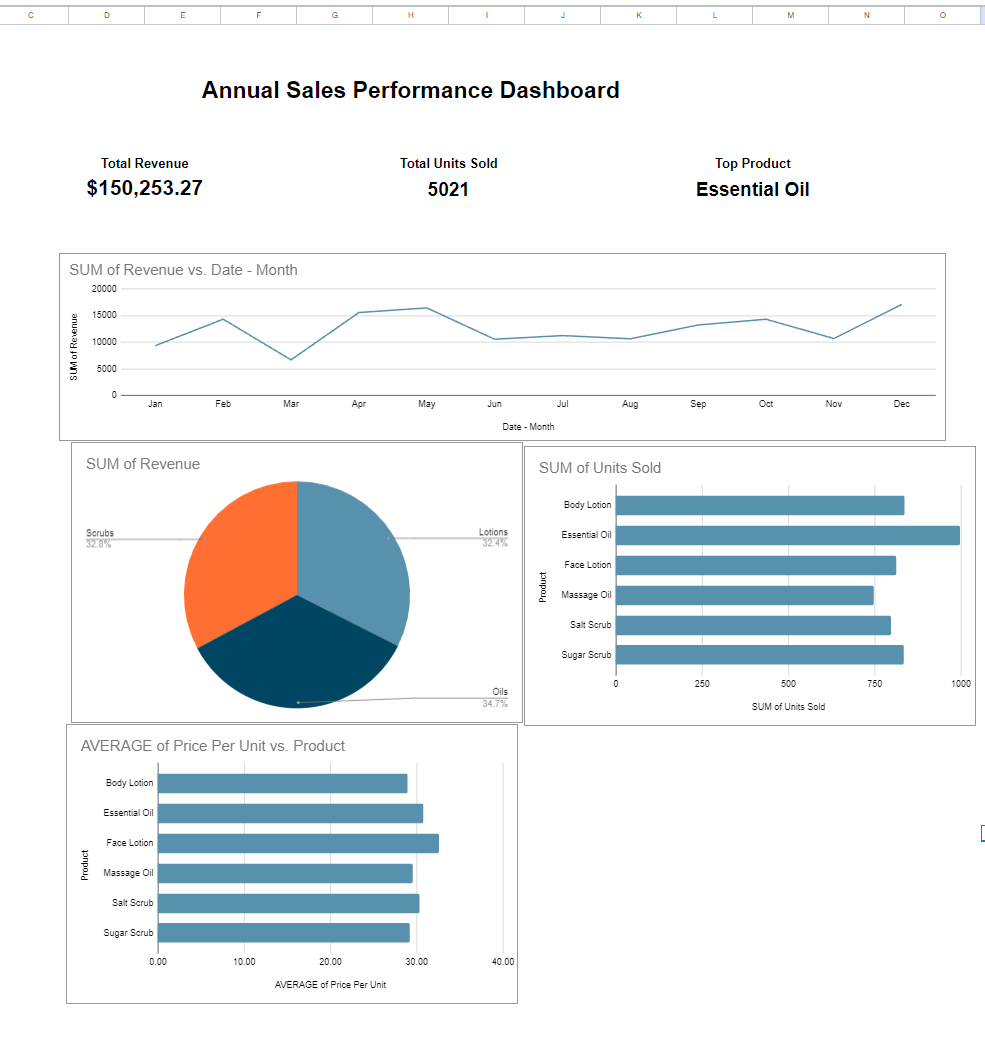
Every dashboard needs a clear title so you and your team can easily identify its purpose. For this example, we’re using Annual Sales Performance Dashboard.
To create the title:
Merge cells across the top row of your sheet.
Adjust the font size to make it stand out.
Center the text for a clean, professional look.
This helps ensure that your dashboard is visually appealing and easy to understand at a glance.
Add Key Performance Indicators (KPIs)
KPIs give you quick insights into your business’s performance. For a sales dashboard, essential KPIs might include:
Total Revenue
Total Units Sold
Top-Selling Products
We’ll use pivot tables to calculate and display these KPIs. Don’t worry—this is easier than it sounds! —
Total Revenue
Select all your sales data. CTRL + A
Go to Insert > Pivot Table and create it on a new sheet.
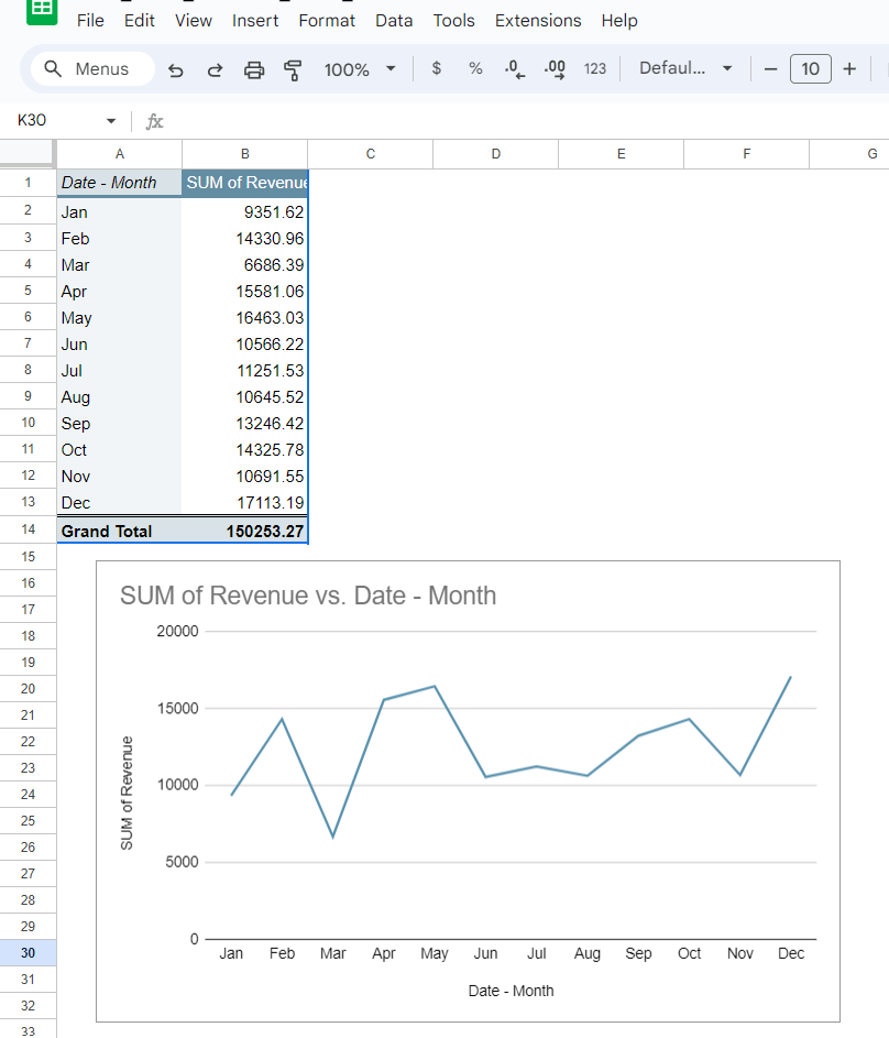
In the pivot table editor, drag Date into Rows and > Revenue into Values.
Right-click the date column, and choose Create Pivot Date Group, > then select Month to group the data by month instead of showing every single day.
Pro Tip: If the grand total isn’t showing at the bottom of your pivot table, you can toggle this setting by going to the pivot table editor, selecting "Rows," and enabling the Show Totals option.
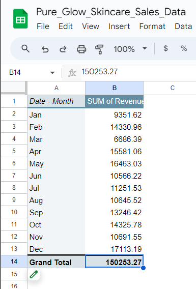
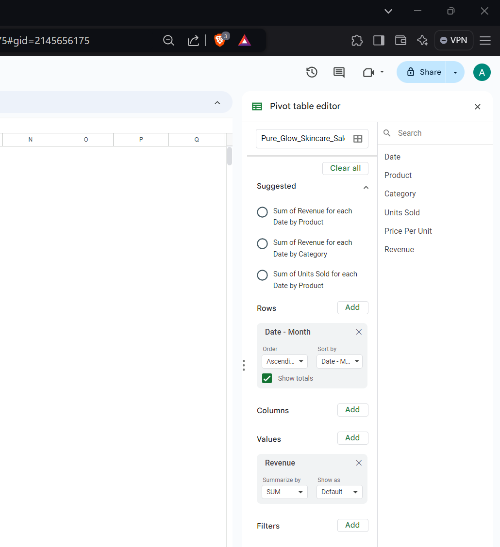
Now, you have a monthly summary of your total revenue! To add this to your dashboard, click on an empty cell in your dashboard, type = and navigate to the grand total in your pivot table, click that, go back to the dashboard, Press Enter, and the total revenue will now appear.
Total Units Sold
Follow the same process for Total Units Sold:
Create a new pivot table on a separate sheet.
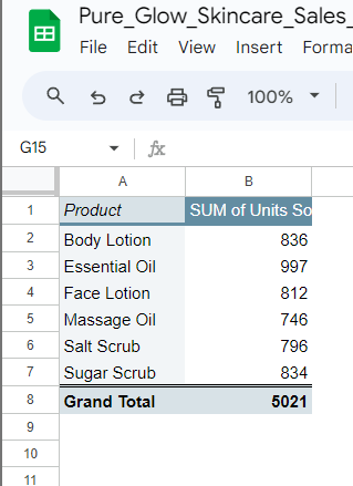
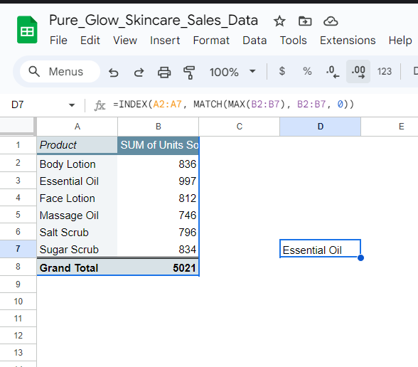
Drag Product into Rows and Units Sold into Values.
Now, the grand total of units sold will appear at the bottom of the table. Copy it to your dashboard using the same method as before by typing = and selecting the grand total cell in the pivot table.
Top-Selling Product
Finding the top-selling product requires a bit of a formula, but it’s easy to follow along. Here’s how:
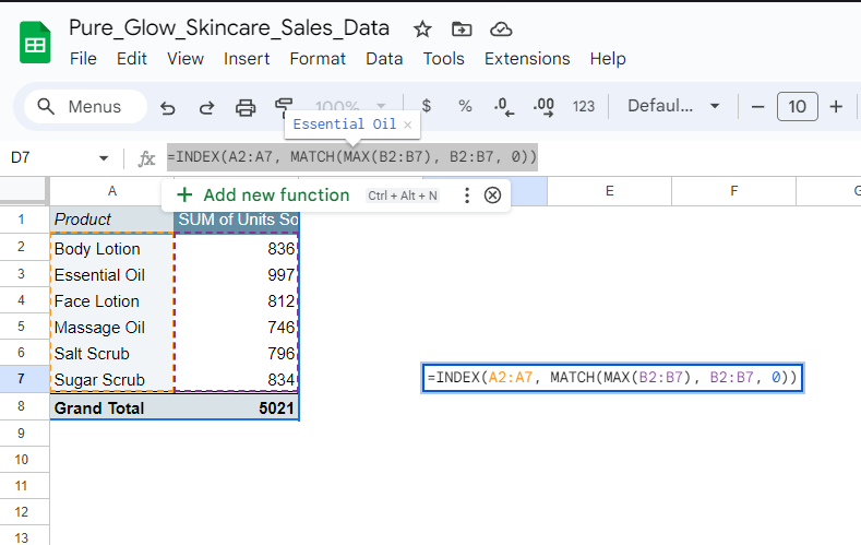
- In the sheet where you created your Units Sold pivot table, write the following formula in a cell outside the pivot table:
=INDEX(A2:A7, MATCH(MAX(B2:B7), B2:B7, 0))
- Adjust the range (A2, B2) to fit your actual data. If you have more data, increase the numbers to match your dataset.
This formula will return the name of your top-selling product. Copy the result to your dashboard the same way you did for total revenue and units sold.
Visualize Your Data with Charts
Now that we have KPIs in place, let’s add charts to make your data visually appealing and easier to understand. Google Sheets makes this simple.
Line Chart for Monthly Sales Trends
To see how your sales fluctuate month to month:
Go to the pivot table where you calculated revenue by month.
Select the data (excluding the grand total).
Go to Insert > Chart, and choose a Line Chart.
This will create a line chart showing your monthly sales trends. Copy the chart and paste it into your dashboard.
Bar Chart for Units Sold
Next, create a bar chart to visualize how many units of each product were sold:
Go to the pivot table you created for units sold by product.
Select the data (again, excluding the grand total).
Go to Insert > Chart and select a Bar Chart.
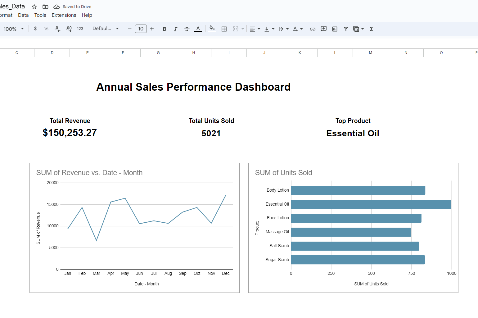
Copy and paste the chart into your dashboard.
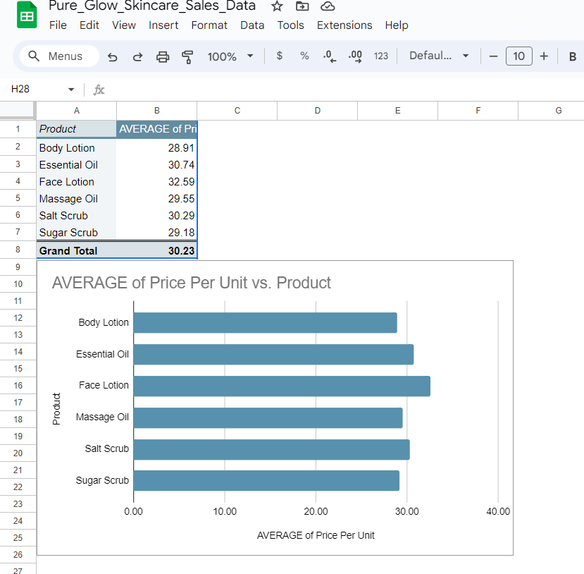
Bar Chart for Average Price per Unit
To calculate and visualize the average price per unit:
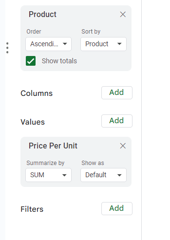
- Create another pivot table, placing "Product" in Rows and
"Price Per Unit** in Values.
- Change Summarize By to Average instead of Sum.
You can also adjust the number of decimal points for better readability. After that, insert a bar chart and copy it to your dashboard.
Again copy and paste this into your dashboard.
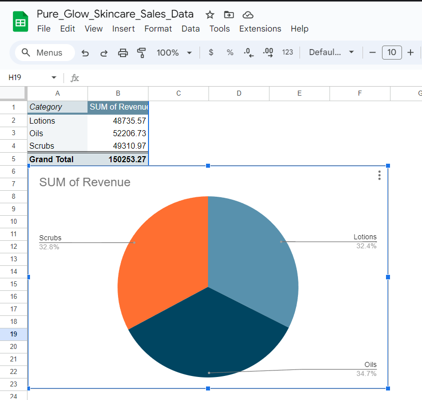
Pie Chart for Revenue by Product Category
A pie chart is great for showing the proportion of revenue generated by different product categories:
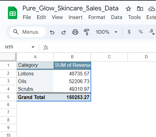
Create a new pivot table with "Category" in Rows and Revenue in Values.
Insert a pie chart to see the breakdown of revenue by product category.
Copy the pie chart to your dashboard for a quick overview of how each category contributes to your overall revenue.
Create a Heat Map for Seasonal Trends
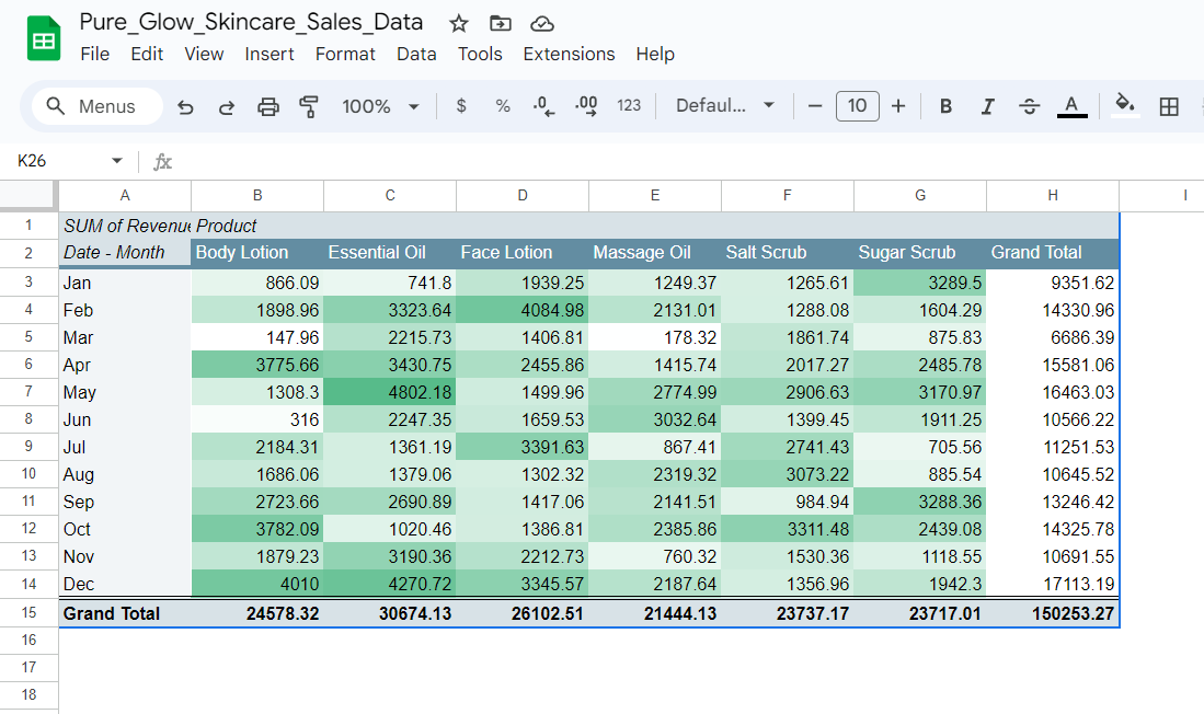
A heat map is a fantastic way to visualize seasonal sales trends. It allows you to easily spot patterns and fluctuations in your sales over time by using color to represent the intensity of the data. While Google Sheets doesn’t have a dedicated heat map feature, you can achieve the same result using a pivot table combined with conditional formatting.
Create the Pivot Table
Insert Pivot Table: Select your sales data and go to Insert > Pivot Table, placing it on a new sheet.
Group Dates by Month: Drag Date into the Rows section. Right-click any date, select Create Pivot Date Group, and choose Month.
Add Product and Revenue: Drag Product Name to the Columns section and Revenue to Values.
This will create a grid of monthly revenue for each product, which you’ll use for your heat map.
Apply Conditional Formatting
Highlight Revenue Data: Select the data in the pivot table (excluding grand totals).
Add Conditional Formatting: Go to Format > Conditional Formatting.
Choose Color Scale: Apply a color scale to represent high sales with darker colors and low sales with lighter colors. You can customize the colors to your preference.
This will turn your pivot table into a heat map, allowing you to easily spot peak sales periods and seasonal trends.
Add the Heat Map to Your Dashboard
- Copy the Heat Map: Highlight the heat map, press Ctrl + C (or Command + C), and paste it into your dashboard sheet.
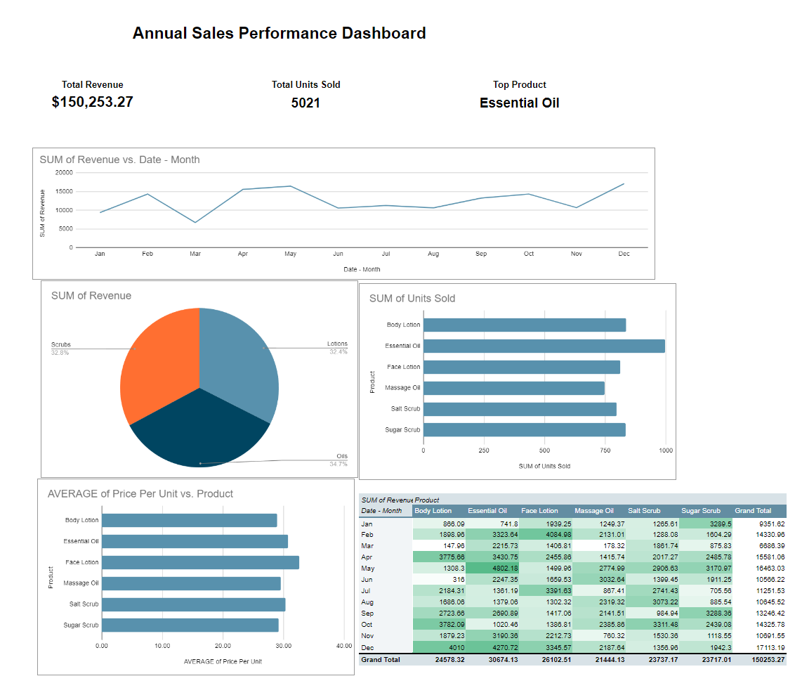
Now, your heat map is part of your dashboard, helping you visualize and understand seasonal sales trends at a glance.
Final Touches and Insights
Once you’ve built your dashboard, you can tweak the design to make it more visually appealing. Here’s a summary of what we learned from the Pure Glow Skincare dashboard:
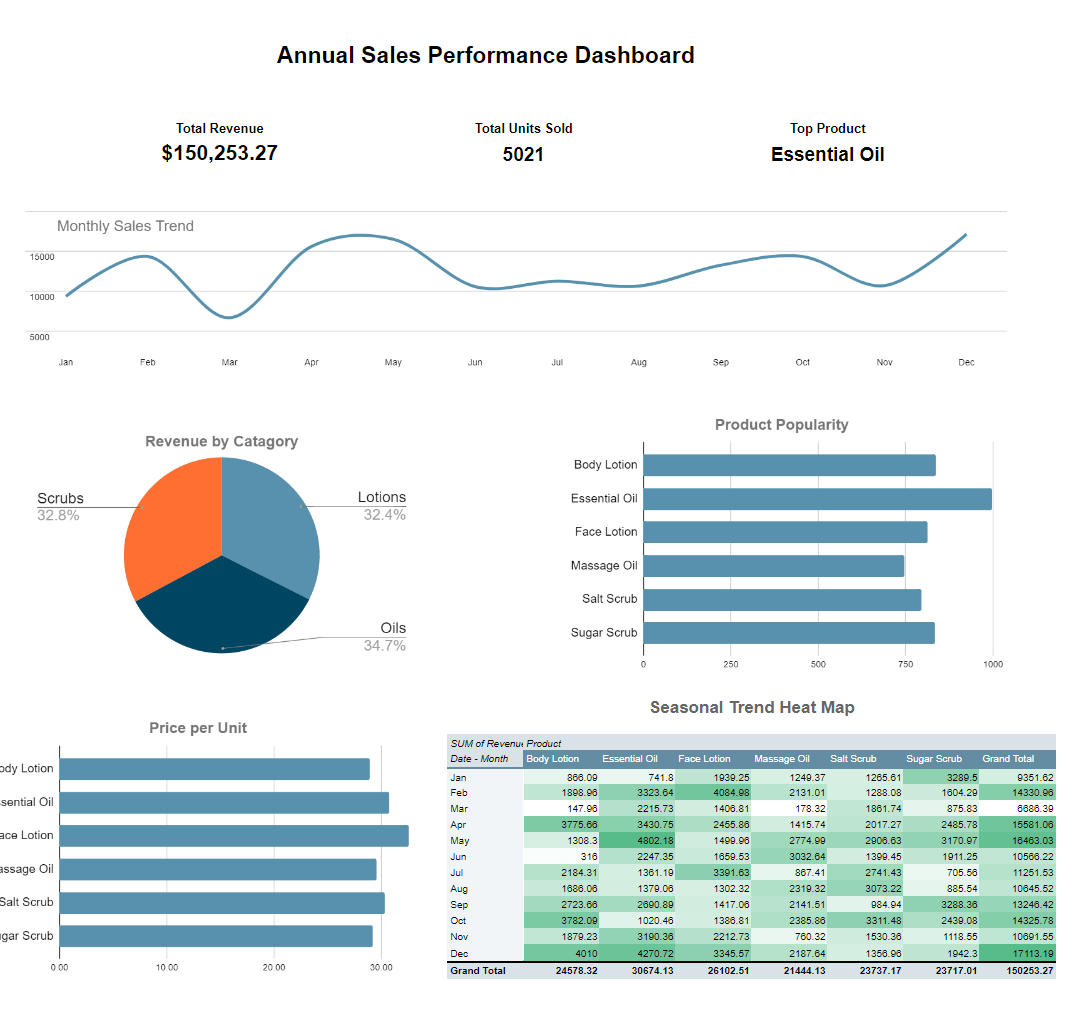
The Total Revenue metric at the top of the dashboard shows the total income generated by Pure Glow Skincare for the year. This is a fundamental indicator of the overall financial health of the business.
What it answers:
Is the business generating enough income?
- You can see that your business has generated $150,253.27 in revenue, giving you a benchmark for future financial planning.
Are the sales increasing or decreasing?
- If you compare this with previous years' data, you can assess whether your business is growing, stable, or declining.
2. Total Units Sold (5,021)
The Total Units Sold metric reflects the total number of products sold over the year, helping you gauge overall sales volume.
What it answers:
How many products did we sell this year?
- Knowing you sold 5,021 units gives you an understanding of your product demand.
What is our average revenue per unit?
- By dividing the total revenue by the units sold, you can calculate the average revenue per unit. In this case, it is around $29.93 per unit, which helps you understand your pricing and product value.
3. Top Product (Essential Oil)
Identifying the Top Product is crucial for sales strategy. Here, Essential Oil is the best-seller, indicating it's the most popular or high-demand product.
What it answers:
Which product should we prioritize for marketing or promotions?
- Knowing that Essential Oil is your top seller, you can invest in promotions, bundling deals, or marketing campaigns to increase its visibility and sales further.
Should we focus on improving or expanding this product line?
- High performance in this category suggests exploring related products or variants to capitalize on its success.
4. Monthly Sales Trend (Line Chart)
The Monthly Sales Trend line chart shows fluctuations in sales over the year. Sales seem to peak around April and December, while there’s a dip in February and May.
What it answers:
When are our high and low sales periods?
- December's peak likely indicates increased sales due to holiday shopping. April could also indicate another seasonal increase.
When should we ramp up marketing or inventory?
- You can use this information to ensure you're well-stocked and running targeted campaigns during high-sales periods (e.g., preparing for holiday promotions or seasonal campaigns).
Do we have predictable sales trends?
- This chart helps you forecast future sales trends and make data-driven decisions about staffing, production, and resource allocation.
5. Revenue by Category (Pie Chart)
The Revenue by Category pie chart shows how your revenue is divided between different product types—Scrubs (32.8%), Oils (34.7%), and Lotions (32.4%).
What it answers:
Which product categories contribute most to revenue?
- The chart shows a fairly even split across categories, but Oils have a slight lead, suggesting that oils are currently the best-performing product type.
Should we diversify or focus on specific categories?
- The even distribution suggests you have a well-balanced product mix. However, if one category were significantly outperforming the others, you might decide to focus more resources on that category.
6. Product Popularity (Bar Chart)
This bar chart displays the number of units sold per product. Essential Oil and Salt Scrub are your most popular products in terms of sales volume.
What it answers:
Which products are driving sales volume?
- Essential Oil has the highest number of units sold, making it the most popular product by volume.
Are there products that may need marketing support?
- Massage Oil and Face Lotion have lower sales compared to others, which might indicate these products need better marketing or promotion strategies.
7. Price per Unit (Bar Chart)
The Price per Unit bar chart shows the average selling price of each product. Essential Oil has a relatively high price per unit compared to the other products.
What it answers:
Are we pricing our products appropriately?
- You can see that Essential Oil and Face Lotion are priced higher, which might explain their strong performance in terms of revenue, even if unit sales aren't the highest.
Is there room for a pricing strategy?
- You can identify if some products (e.g., Body Lotion) are priced lower and potentially increase the price to boost revenue if demand remains steady.
8. Seasonal Trends Heat Map
The Seasonal Trend Heat Map shows how each product performed across the year. The darker the green, the higher the sales, and vice versa.
What it answers:
When are our peak sales months for specific products?
The heat map reveals that sales for products like Essential Oil, Body Lotion, and Salt Scrub peak in December, aligning with holiday shopping trends.
April also shows increased sales across multiple products indicating another strong sales period.
How can we optimize our inventory or promotions?
- You can plan marketing campaigns and stock more inventory around peak sales months. For example, running promotions on Essential Oils in December or preparing inventory ahead of time for the expected holiday rush.
Are there any seasonal dips to address?
- The map shows sales dips in June and July, suggesting these might be slower months. You could consider offering special summer promotions or limited-time deals to increase sales during these periods.
Summary of Insights:
This sales dashboard gives you a comprehensive view of Pure Glow Skincare's performance. Here’s a breakdown of key business questions it answers:
How is the business performing overall? Total revenue of $150,253 and 5,021 units sold indicate strong performance.
Which products are most successful? Essential Oils lead in both sales volume and revenue.
When are the peak sales periods? December and April are high-performing months, suggesting these periods should be targeted for promotions.
How can we better manage inventory and marketing? By analyzing the heat map and product popularity, you can ensure you're well-prepared for peak seasons and adjust pricing or marketing for underperforming products.
This dashboard is a powerful tool that allows you to make data-driven decisions and optimize your business strategy for growth.
