How to Create an Easy Cash Flow Dashboard for Beginners
Published:
If you’re looking to create a simple yet effective cash flow dashboard that tracks revenue and expenses, this guide is for you. Whether you’re a beginner in data analysis or just getting started with financial dashboards, you’ll learn how to turn raw data into a clear visual overview of your business’s financial health.
The Story Behind the Dashboard
Let me take you on a journey of how I created a Cash Flow Dashboard for a fictional SaaS startup. Imagine a brand-new company trying to manage all the money coming in and going out. With so many numbers flying around, it’s easy to get lost! That’s where this cash flow dashboard comes in, making everything easy to see at a glance.
Starting with the Basics—Data, Data, Data!
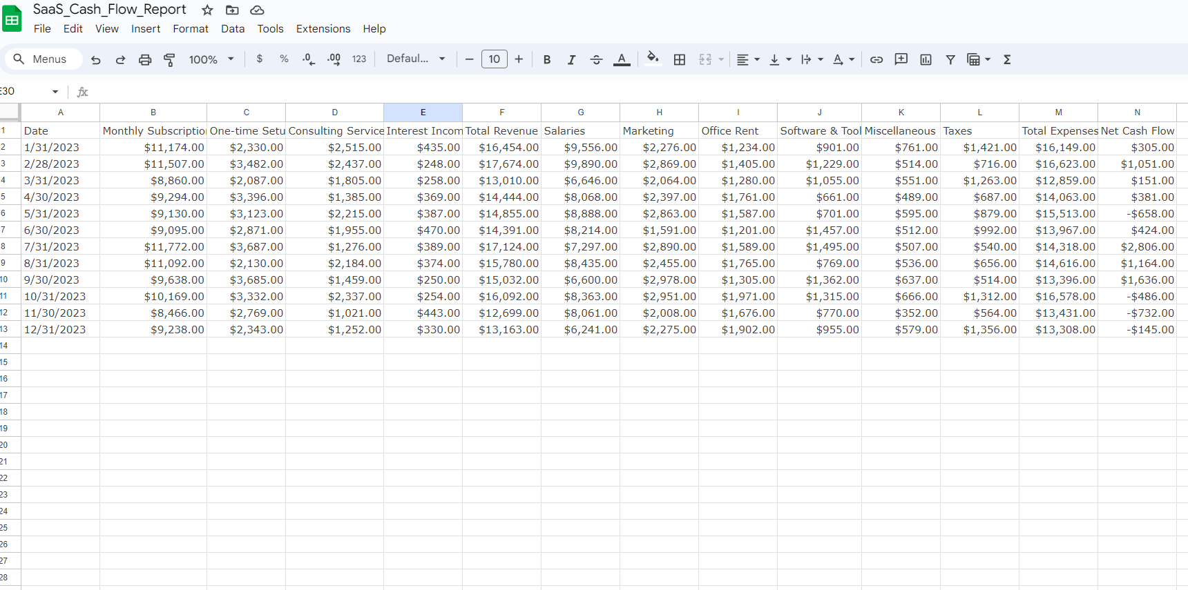
First things first, I had to get my hands on the data. I pulled together some mock numbers for revenue and expenses, like:
- Revenue: How much money is coming in from subscriptions, one-time purchases, and consulting work.
- Expenses: All the money going out for marketing, operations, research, and those pesky admin costs.
The data was structured monthly, allowing us to track cash flow over the year. This type of organization is crucial for financial analysis because it makes it easier to identify trends over time.
Pivot Tables—The Real Heroes
One of the most powerful tools for a beginner in data analysis is the pivot table. They may sound intimidating, but they are essential for summarizing and analyzing large datasets.
- Revenue Pivot Table: I grouped all the revenue categories (subscriptions, consulting, etc.) by month. This showed where the big bucks were coming from and when.
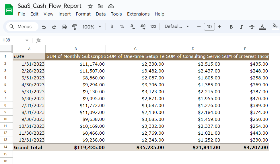
- Expense Pivot Table: I broke down the company’s monthly spending. Were they investing more in marketing? Spending too much on admin? This table had all the answers.
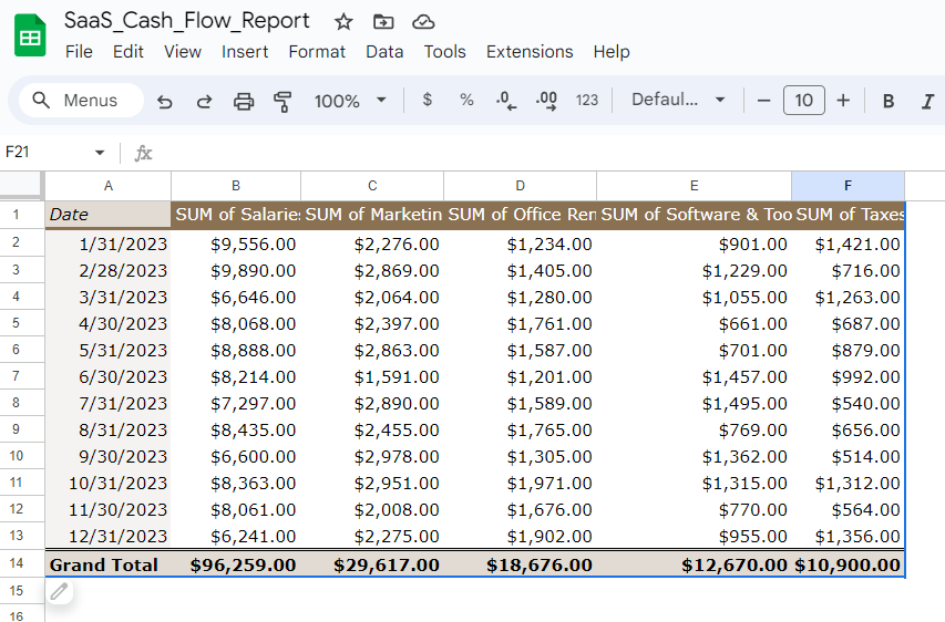
- Cash Flow Pivot Table: I subtracted the expenses from the revenue for each month, calculating whether the company was profitable or losing money at any given time.
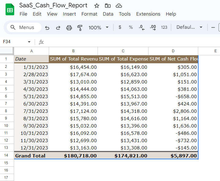
Bringing the Data to Life with Charts
After organizing the data, the next step was to create charts. Charts are essential for dashboard visualizations because they turn complex data into something easy to understand.
- Cash Flow Line Chart: Displayed the company’s cash flow month-by-month, making it easy to see when the company was profitable.
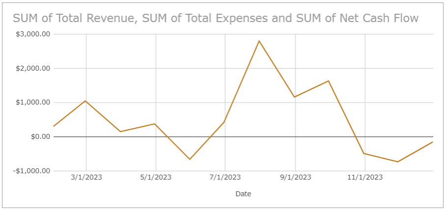
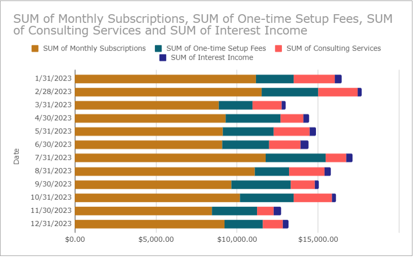
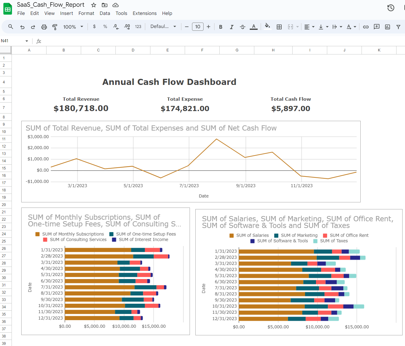
- Revenue Stacked Bar Chart: Stacked the revenue streams (subscriptions, consulting, one-time purchases) by month, making it easy to see what was bringing in money and when.
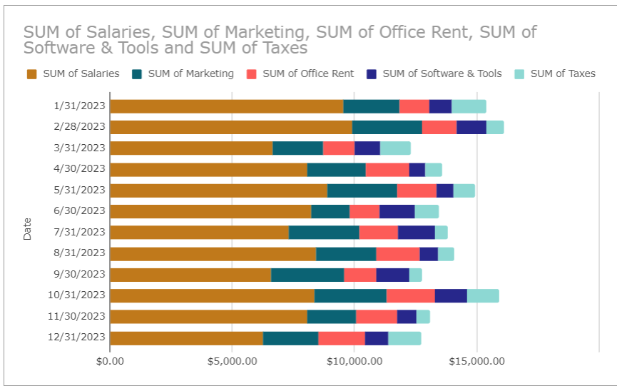
- Expense Stacked Bar Chart: Similar to the revenue chart but for expenses (marketing, operations, R&D, admin), quickly showing where the company was spending the most.
Assembling the Dashboard
With the data and charts ready, it was time to assemble the full cash flow dashboard.
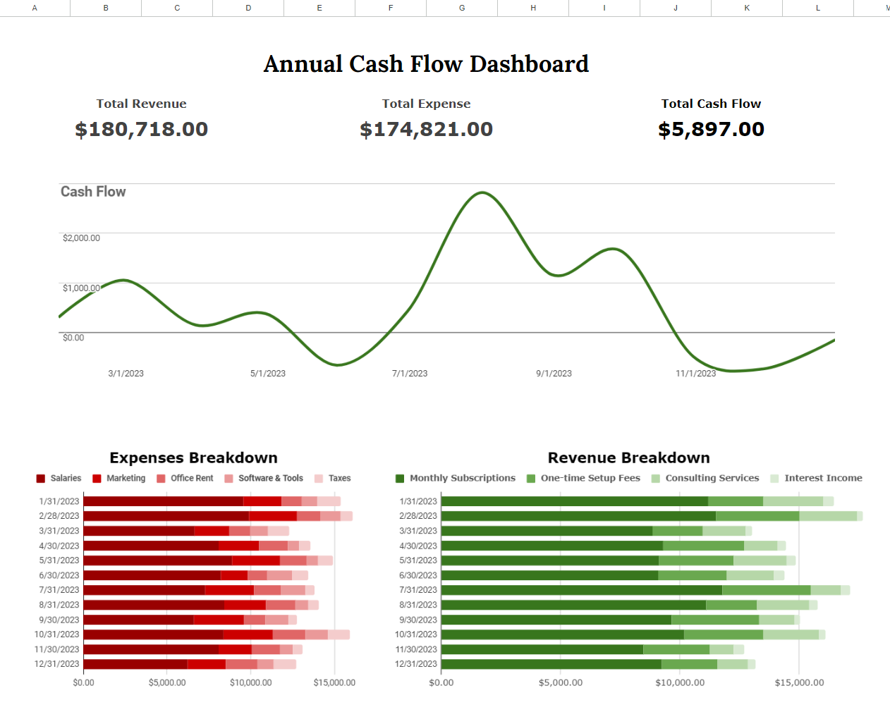
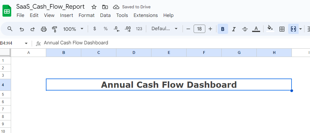
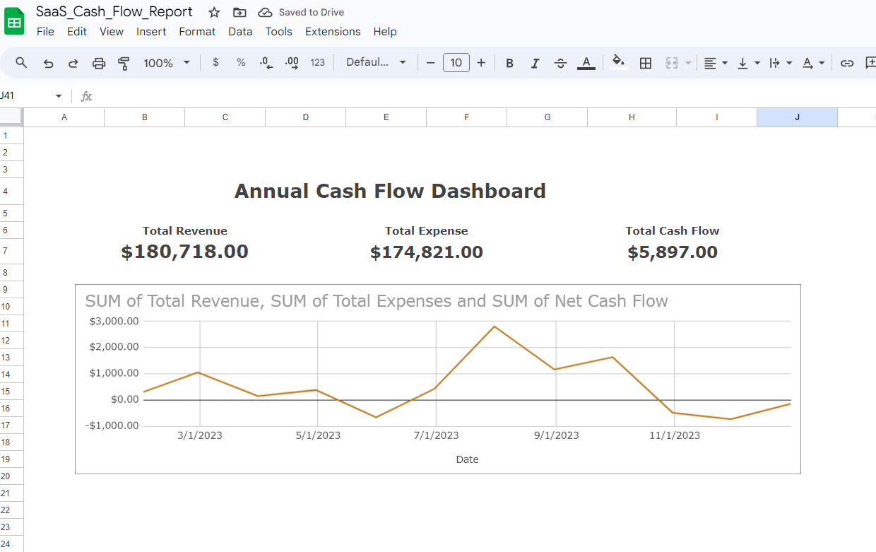
- Header: Created a heading that reads “Annual Cash Flow Dashboard.”
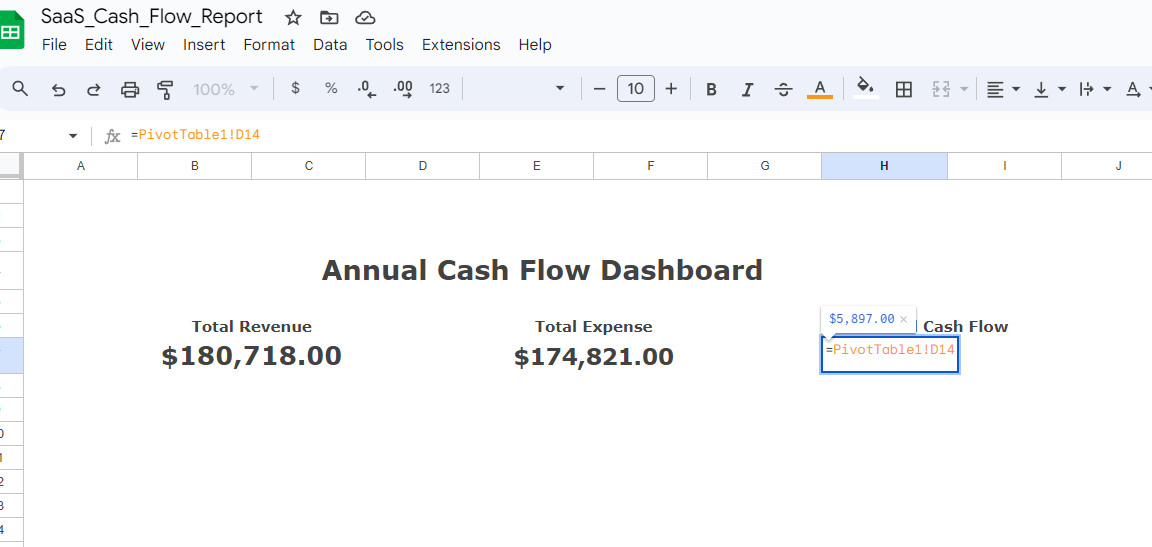
- Key Metrics: Displayed key financial metrics like total revenue, total expenses, and overall cash flow, which updated automatically as the data changed.
- Cash Flow Line Chart: Positioned below the key metrics, giving a quick overview of cash flow fluctuations over the year.
- Revenue and Expense Breakdown: Placed two bar charts side-by-side for revenue and expenses, broken down by category for easy trend spotting.
Design and Aesthetic Tweaks
A great dashboard is not just about the data; it’s about making the data easy to read and interpret.
- Simplified Layout: Removed unnecessary labels and simplified the grid to focus on the charts.
- Color Coding: Used green shades for revenue and red shades for expenses. Darker greens indicated more revenue, while darker reds indicated higher expenses, making financial trends easy to identify at a glance.

You can view the full cash flow dashboard by clicking the link below:
Cash Flow Dashboard Spreadsheet
What the Dashboard Taught Me
Once the charts were in place, the story of the company’s finances became clear:
- Revenue Insights: Monthly subscriptions were the most reliable revenue stream, but consulting services provided substantial boosts during certain months. This suggests the importance of nurturing consistent income while capitalizing on high-revenue opportunities.
- Expense Patterns: The expense breakdown highlighted heavy investments in marketing and R&D, pointing to a growth strategy. However, the company may benefit from optimizing some costs to improve cash flow.
- Cash Flow Trends: The cash flow trends revealed when the company was most stable and when it was at risk of overspending. This insight allows for better financial planning and adjustments.

